Decorating with artwork is a little like adding the perfect accessories to a cute outfit to make it really pop. It’s part of what I like to call “a look and a feel.”
But one of the trickiest styling details to master is layering. Just ask any designer. And that includes layering lamps in and around your wall art.
There’s only one type of person who even has a tiny inkling about layering or styling lamps in front of artwork. And that’s usually the designer or the person with a designer or decorating gene.
And it’s totally okay if that’s not you.  Because I’m going to show you two ways I helped my sister solve this styling challenge in her house.
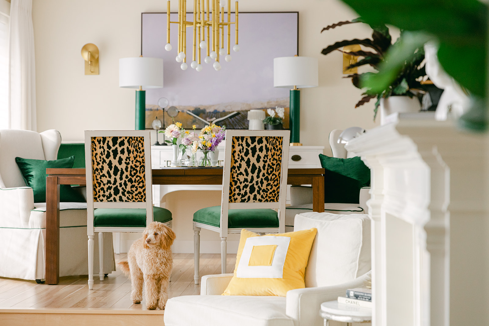
I did this in my living/dining room makeover here.
Styling masters do this all of the time
Just like any good decorating, beautiful art deserves ample lighting. But adding lamps to tables with wall art behind them is a layering skill that can be tricky for the novice home designer.
Which is also why it was difficult for my sister to wrap her head around lamps-in-front-of-her-art.
Because if you study rooms and the masters of styling, you’ll see that they do this all the time. See some examples here, the last time I mentioned this styling trick.
My sister Anita and her husband Aaron have been collecting art for years. And it ended up looking a little thrown together. I haven’t seen Anita in a long time (that story is coming later this week). That’s why the art hanging and lamp shopping (aka Maria the Decorating Fairy) hadn’t happened sooner.
Art is personal
First, there’s a bear in the dining room (below).
I said to her, “Hey, doesn’t she belong in a cabin in Whistler?”
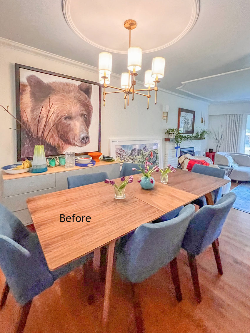
Bear artist: Doria Moodie | Turtle artist: Wyland
“No,” she replied. “I love her. I love her eyes.”
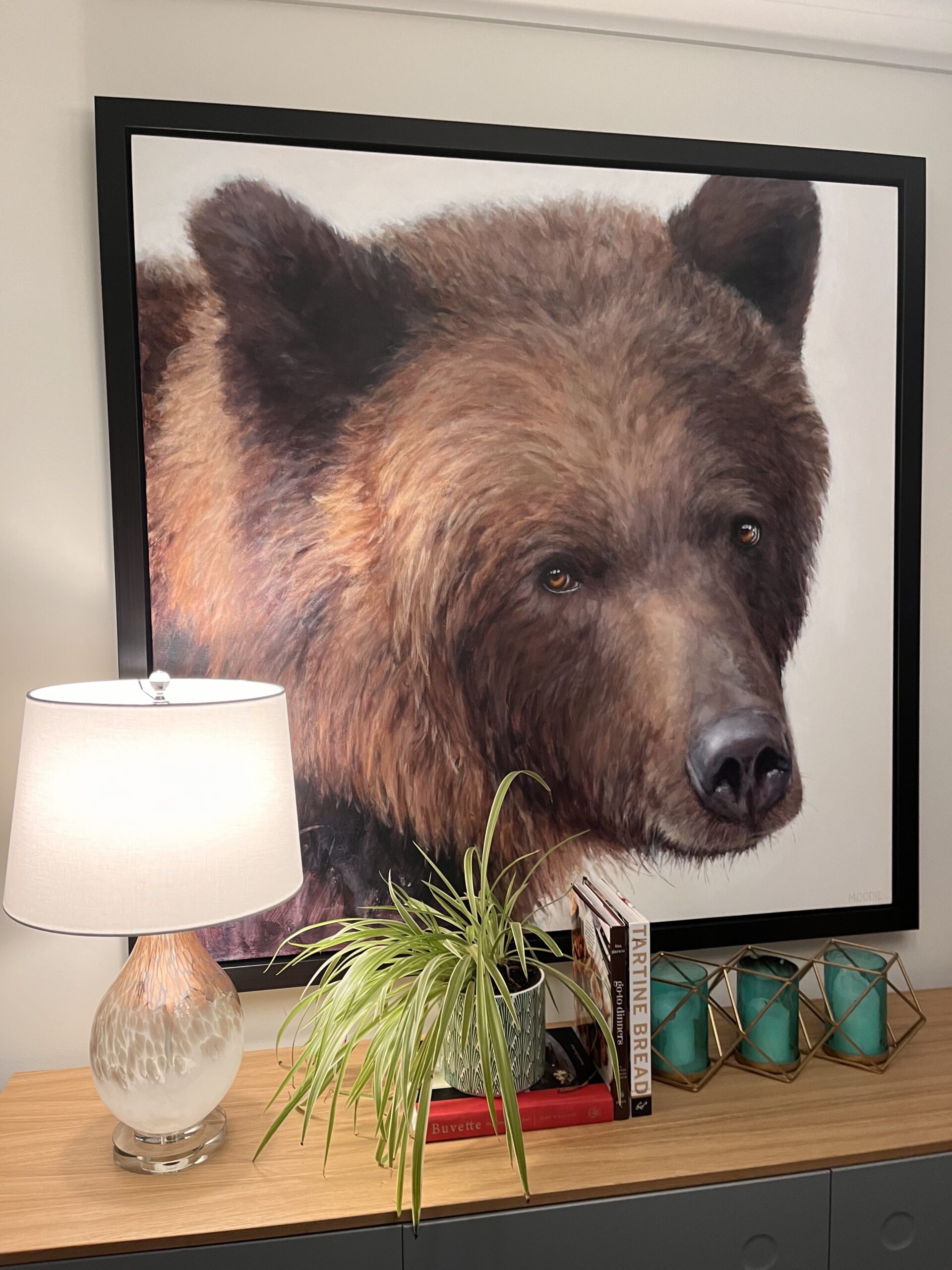
New Lamp
Ok then. But she could still use a little more light. So, we found this pretty lamp, which matched the bear art perfectly.
Then over her mantle she has a turtle, and it’s on the same wall as the bear (above).
I said, “Don’t you have something more mountain-related for above the mantle?”
Again, she replied, “No. We we bought Franklin [the turtle] when we were snorkelling in Hawaii. It was the first time we had ever seen turtles.”
“Okay,” I said. Franklin is staying where he is.
Styling lamps in front of art
I’ll show you how I rearranged her art later, but today I’m talking about lamps. Anita’s small 60s home basically faces north. The living room gets a little western sun in the summer but it’s DARK. So, she definitely needs lamps to bring life into her decorating.
Because lamps are also like accessories, it can be hard to choose the perfect combination of art and lamps.
The first lamps I suggested when we saw them in HomeSense were the skinny buffet lamps, which she liked best in the end. But when I spotted them in the store, she looked at me skeptically, “Really? No Maria.”
Here’s where we started.
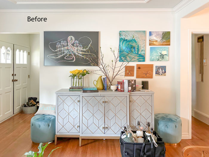
My sister had purchased a beautiful watercolour called Springtime in BC (Joffre Lake) over a year ago and then had it framed. But it ended up sitting on her floor because it was heavy and she thought it required a handyman to hang it. So there it sat, and every day it bothered her that it wasn’t hung.
This is the story of how Anita found this particular art:
“I was at a writing workshop at Hollyhock on Cortes Island. During this weekend retreat, there were multiple different classes going on. Each evening after dinner one of the workshop instructors would do a talk on their specialty.
David McEown was doing a workshop on water colours. On the night of his talk, he had the flower painting with him. Immediately I fell in love with his work and this painting.
I talked about it for months to my husband Aaron. I went on about this artist and his beautiful watercolour art. I even stalked the artist on Facebook and I couldn’t stop telling Aaron that “our next piece will be by David McEown.” Three years post my unrelenting, “David McEown is a watercolour genius I need his work on my wall” we decided to purchase a piece from his collection as a Christmas present for us (ok, me!).
When we went to view David’s work, I asked him about the bright, big painting with all the flowers from the workshop. He still had it. Like it was waiting for me.“
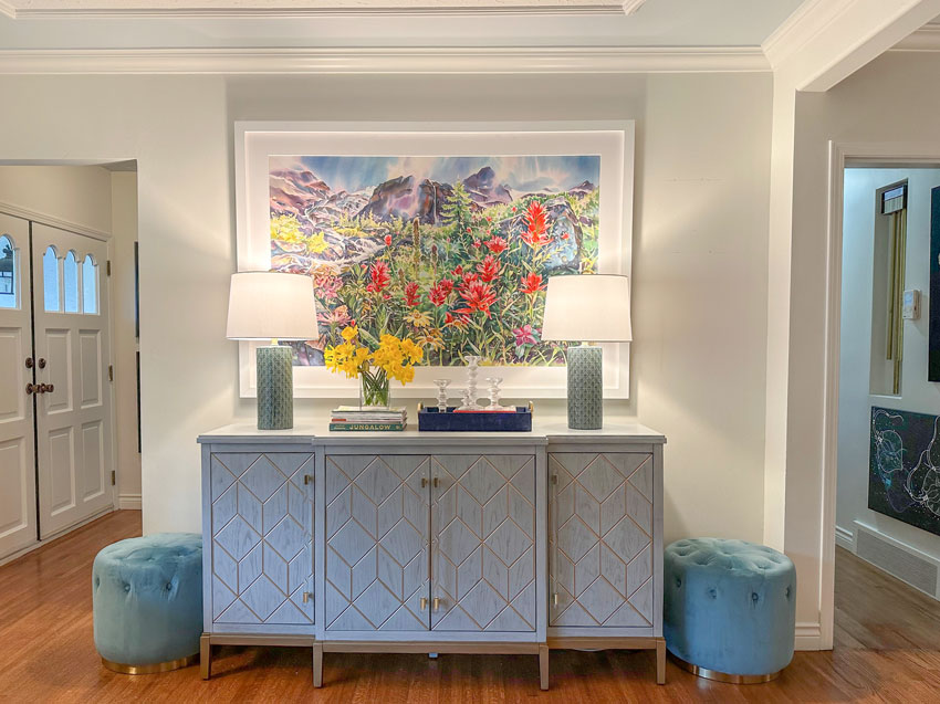
Layering Lamps Option 1
Obviously this art was special to Anita, which is why when we finally hung this piece on her wall and placed the green lamps, she was a little dismayed at the idea of covering the art with the green lamps we selected–even if only a little.
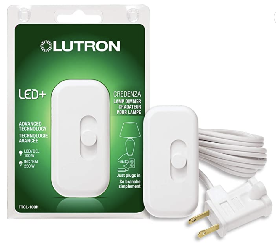
By the way, this little switch plugged into both lamps is also a dimmer. It sits on the table (you can hide it behind the lamp) and you can turn them both on with one switch:
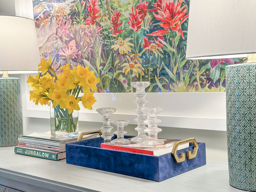
Here’s a close up so you can see how cute these green lamps are. It looks like little leaves all over them. So good with the art, right?
Layering Lamps Option 2
“Okay,” I said. “Then we need the buffet lamps, which are a lot skinnier.”
And here’s a look at the lamps my sister initially scoffed at:
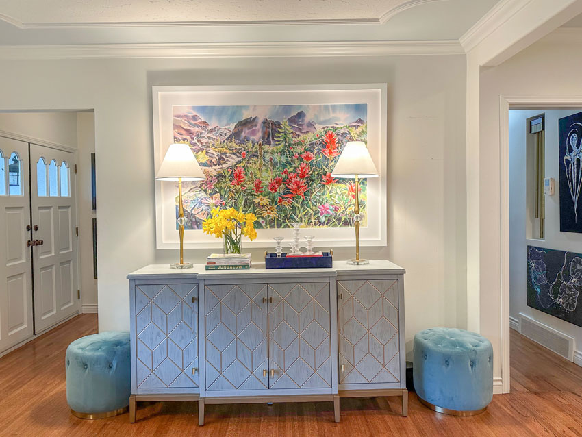
She agreed these were much better.
And then she said, “But FYI, when you’re not looking, I’ll be moving them over to the edge anyway.” 
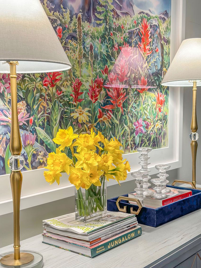
I guess you win some and lose some.  In addition to lamps, I also created a pretty table vignette for her.
Good styling begins with good editing
Notice, I’ve employed the basics of a perfect tablescape or vignette formula.
It includes coffee table books, candles and flowers. Oh, and a tray. Without a tray or coffee table books (or both) to act as a pedestal, your smaller accessories are at risk of looking like Tchotchkes or knick-knack clutter rather than pretty styling. Just sayin’.
Here’s a post I wrote about how to create the perfect vignette.
Also, if you feel your house might be full of too many knick-knacks already, consider you might need some updated ones. That means you need to do some editing and remove some of the old ones.
Then, take a trip to your local HomeSense or HomeGoods and just experiment. You don’t need to know where it all goes, just buy things that you like in varying sizes and play around with them.
And don’t be afraid to stick a bird or a fish or something fun or interesting like that into your cart too.
You can always upgrade your accessories when you find things that are meaningful from a trip for example. But I wouldn’t let that stop you from stacking up some books and placing your Iittala candle holders from Finland (above) on display.
But Maria, do I really need more accessories?
I had this exact conversation with a client recently who was trying to reconcile shopping for random accessories around town for her home. And this was what I told her.
If decorating doesn’t come naturally for you, it will be hard to spot a good accessory even if you saw one on your travels. But when I arrive with my experience in styling, I can create a vignette from your authentic travels and art with HomeGoods/Homesense colours mixed in. And I promise, you’ll be a convert.
Here’s the before again:

And here’s the after.

We had Easter dinner at Anita’s home last night and here are all 4 of us girls with my Mom:

And take a look at her beloved art again with a fresh vase of new flowers that arrived. She loves how the painting looks 3D with the vase positioned in the front:
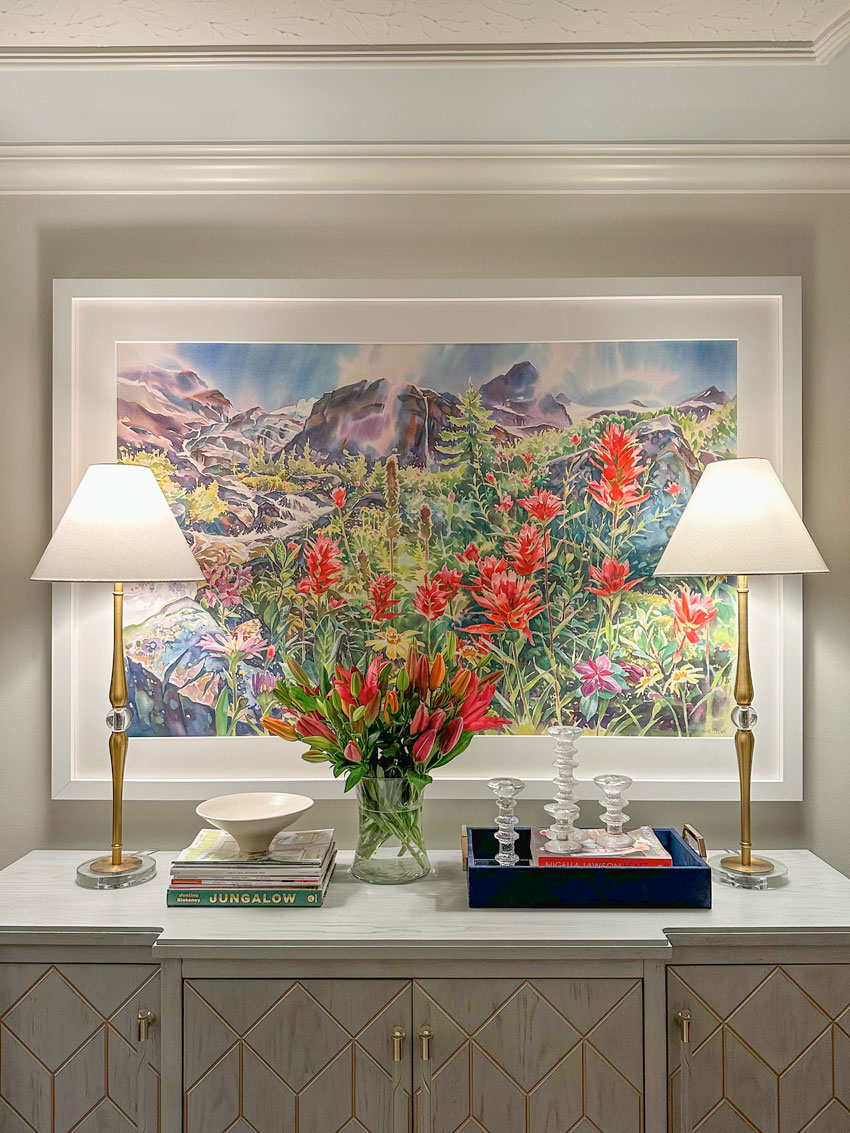
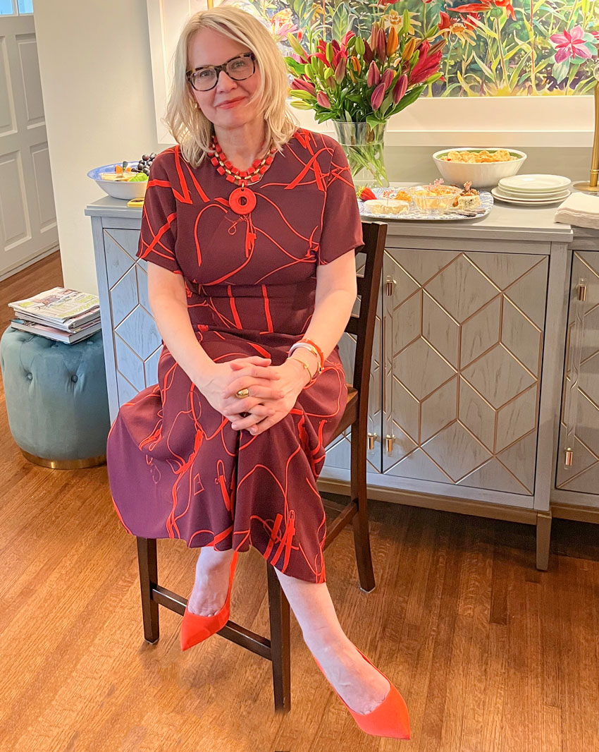
OOTD: For Easter, I wore the Victoria Beckham dress I bought at the Nordstrom Rack a couple years ago. So fun that I had an event to wear it to!
Over to you my lovelies.
Which lamps do you prefer? Then take a look around the house… do you have enough lamps?
Become a True Colour Expert this Spring, register here.
Related posts:
Anita’s Pink Beige & Yellow Living Room; Before & After
My Sister is a Food Network Star!
How to Create a Vignette or Tablescape
The post Styling with Lamps and Art: Two Ways appeared first on Maria Killam | Timeless Colour.

